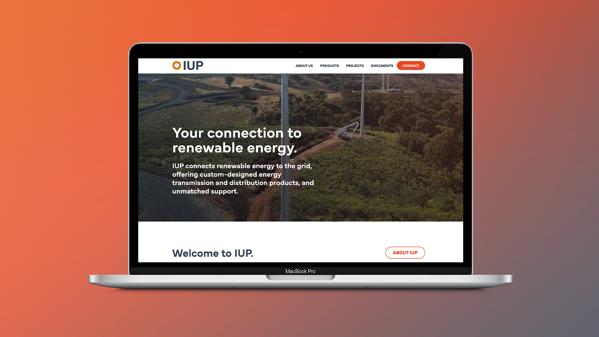
IUP / Brand Realignment & Refresh.
Brand power-up.
- Discipline
- Industry
IUP is Australia's third largest pole company that connects renewable energy to the grid, offering custom-designed energy transmission and distribution products.
With over a hundred years of collective expertise, their team has successfully delivered energy transmission and distribution solutions across Australia, New Zealand, and Pacific Island Nations.
Challenge.
IUP's success had been heavily leveraged relationships and connections of the business owners; and as a result both the brand and online presence had not had to do too much heavy-lifting. Anticipating the future, the Managing Director recognised that a business should not rely solely on personal brands; and that the current brand collateral was not reflective of IUP's capabilities, people and products.
IUP operates in a changing and competitive global economy. The pandemic had pushed many of their meetings and processes from in-person to online; which was compounded by the influx of tech-savvy, socially conscious millennials into their customer base. These new customers valued readily available data; testimonials to inform their business decisions and seamless digital experiences - which IUP's online experience was not entirely ready for.
IUP realised a realignment & refresh of their brand would create a more accessible and quality online experience which would attract and grow their customer base and be more reflective of their full capabilities.

Response.
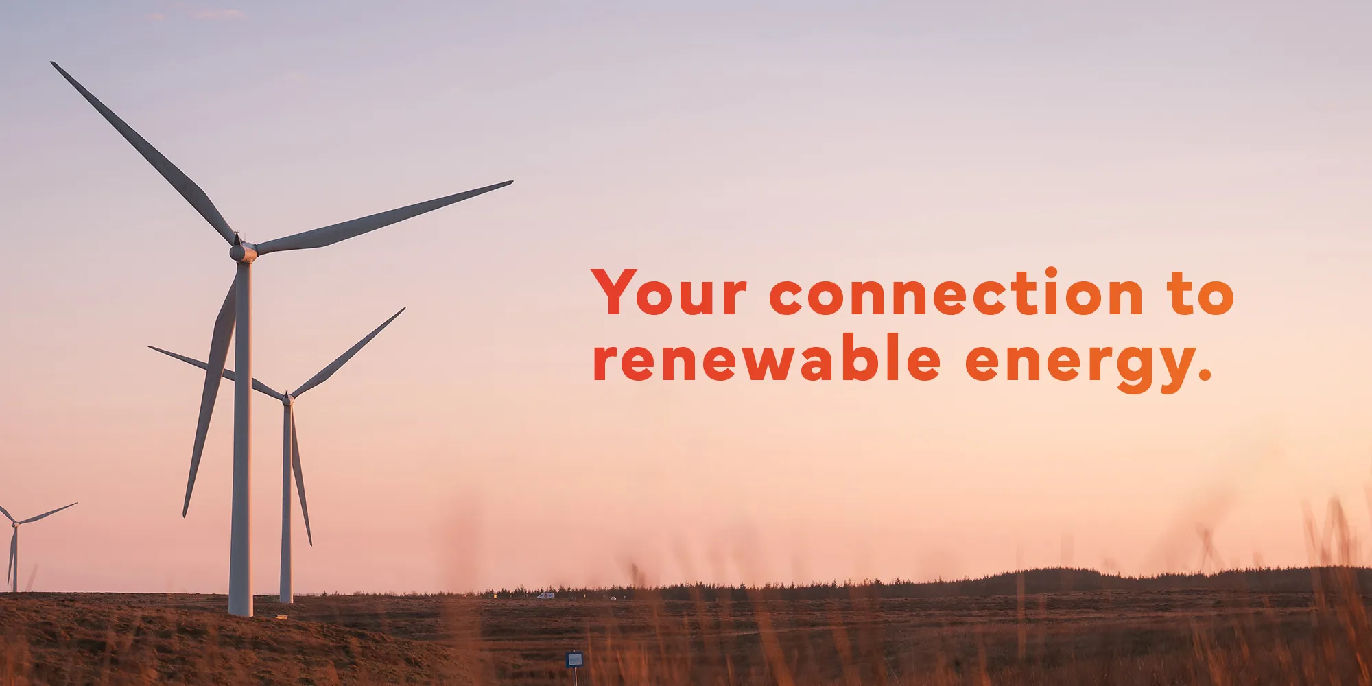
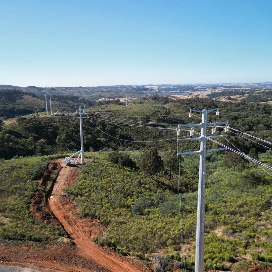
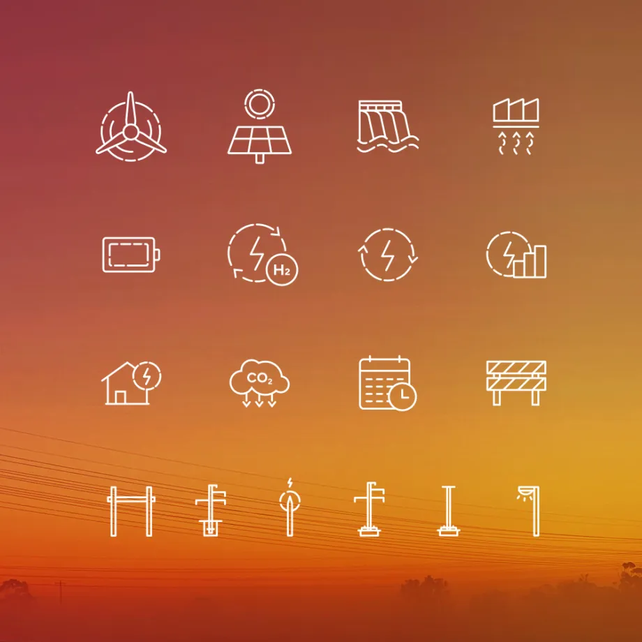
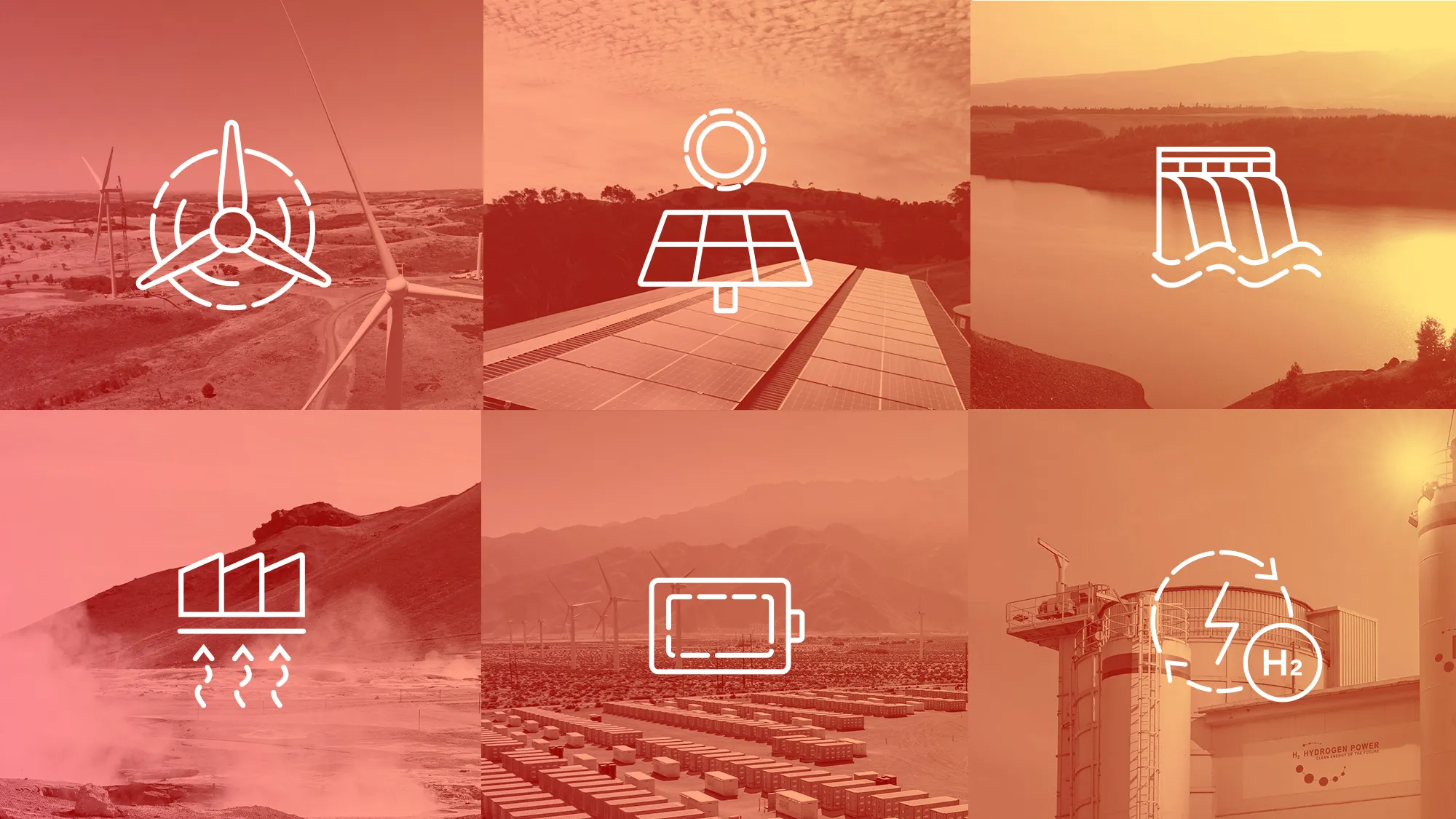
Axiom redefined their brand strategy and updated the brand identity to appeal more to their increasingly millennial audience. We highlighted that IUP's projects were predominantly now in the renewables sector, connecting wind, solar, geothermal and hydropower sources to the grid. Capitalising on this discovery, we defined IUP's USP (sorry, had to do that) as 'your connection to renewable energy' to align with the environmentally conscious views of their audience.
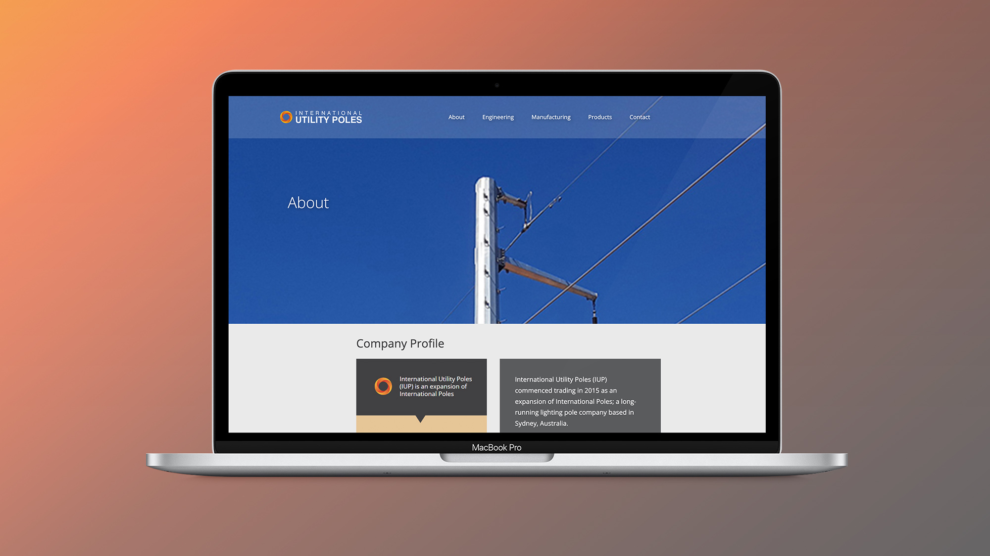
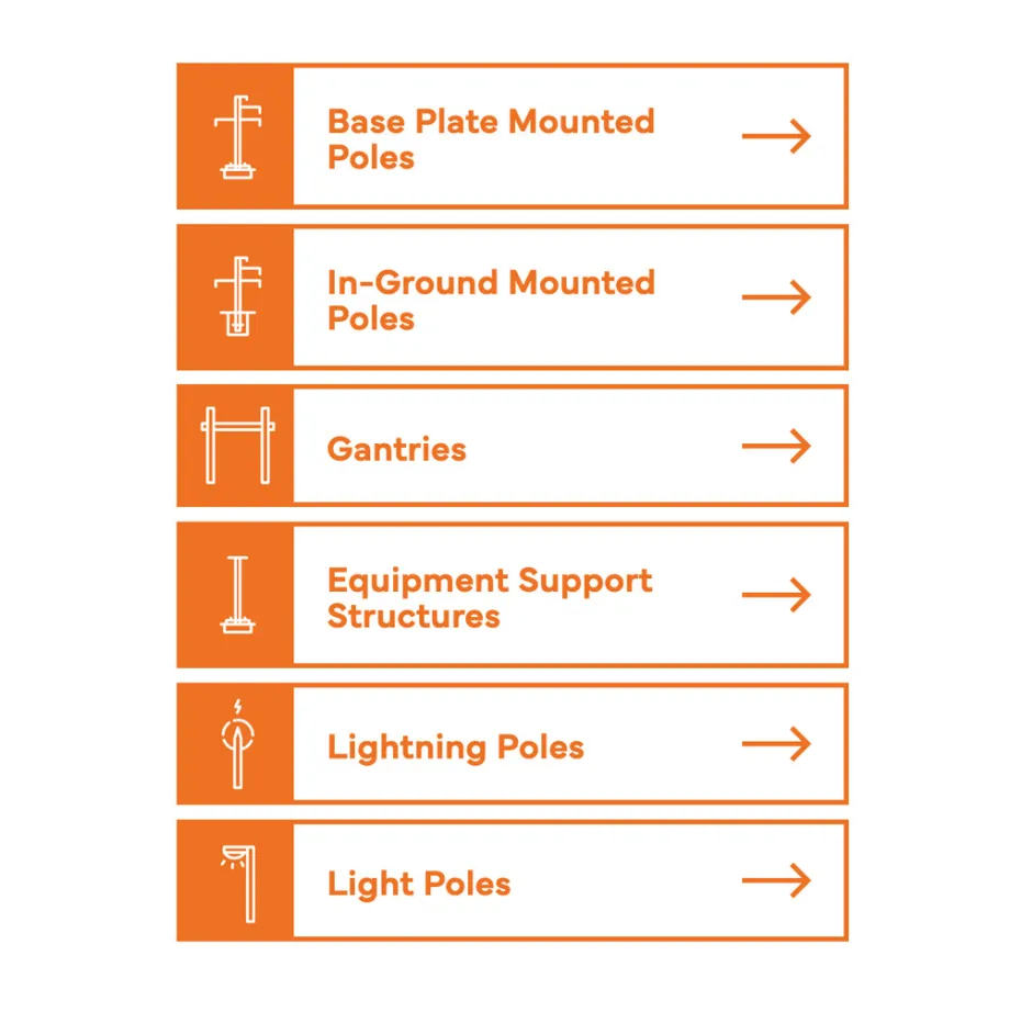
In-line with the positioning, we introduced a bright orange-red gradient, a more modern typeface and imagery of their projects across Australia, New Zealand and the Pacific Islands. We deployed a new website that demonstrated their full capabilities; facilitated easy navigation and allowed users to easily find information they required.
Result.
The new website has captured the attention of their millennial customer base with its clear renewable-focused messaging and seamless user experience. Targeted digital campaigns and content marketing centred on IUP's commitment to the renewables sector has increased awareness, credibility and cemented IUP's standing in the industry.
Having previously worked with Axiom almost a decade ago, I again approached Axiom looking for their direction and advice for IUP. Our business had grown, but we hadn’t been proactive in updating our digital presence or brand since our inception. We broadly understood we needed to change our approach and adapt to meet the demands of not just today’s electricity market, but also speak to the next generation moving into decision-making positions within the industry.
Axiom worked with us to reposition the value proposition of IUP, redesign our website and recalibrate how we will communicate with the market. I provided them the necessary details of the business, the market and filled out their questionnaire, and they took it from there. The whole process was very smooth, methodical, and insightful; it was very easy for me to say ‘yes’ to their suggestions at almost every step. I’m very happy with the result and the ease of working with the team at Axiom.
